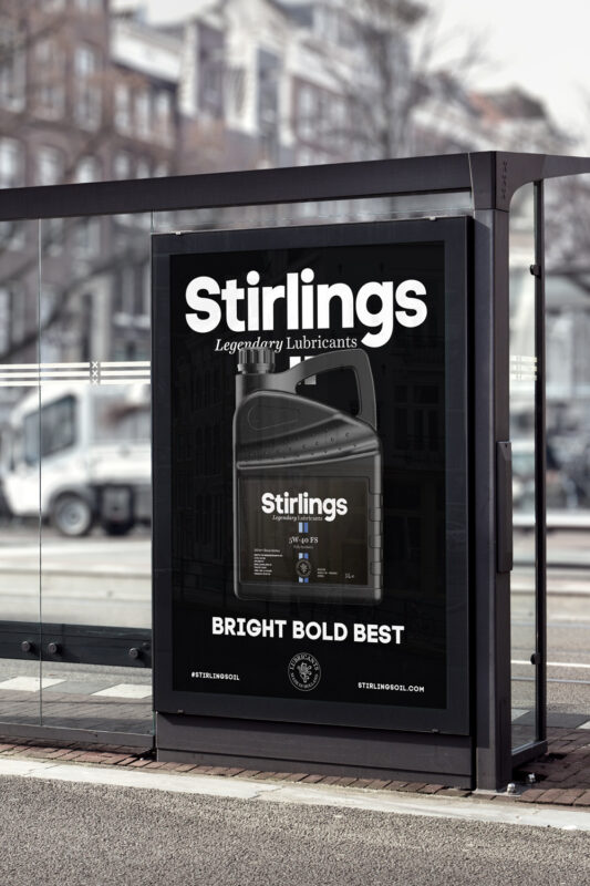
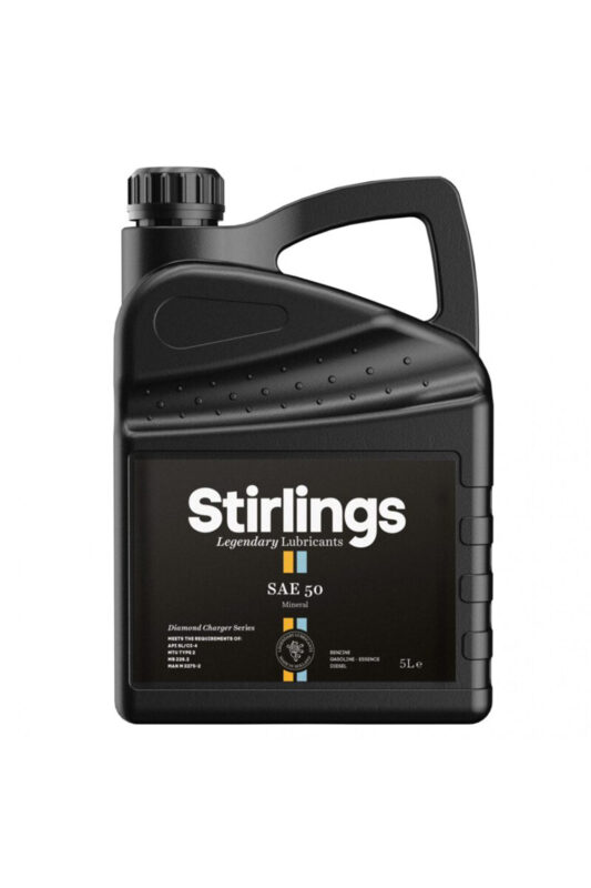
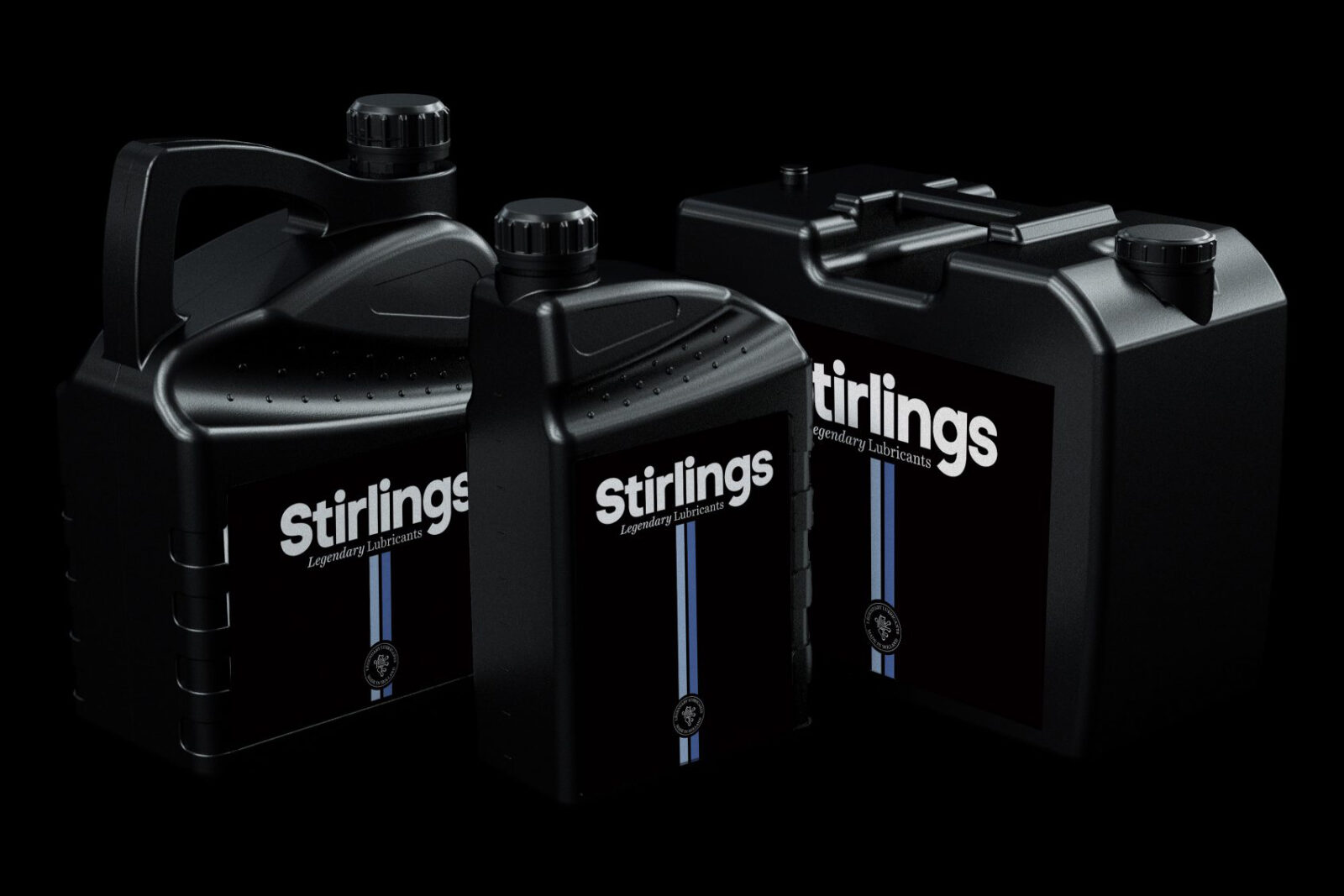
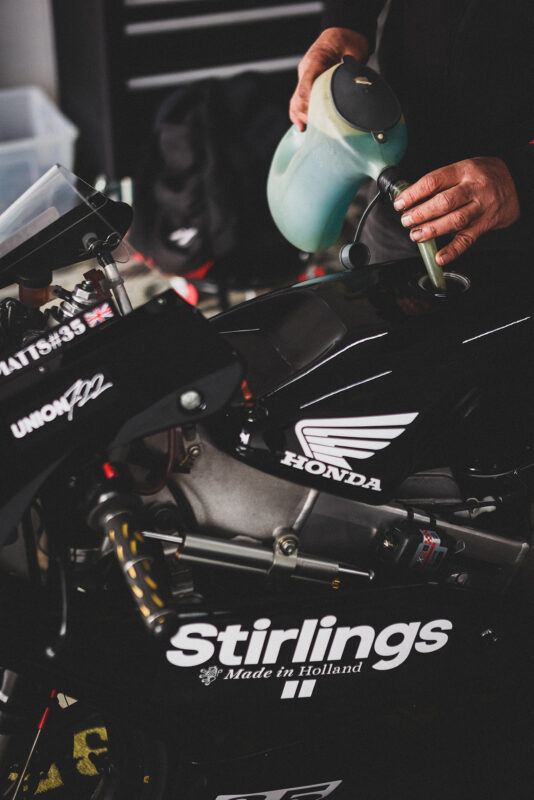
Stirlings sells a commodity product hardly visible to consumers. So, why invest in building a brand? Because businesses don’t make decisions. People at those businesses do. And we believe that they love brands with beliefs.
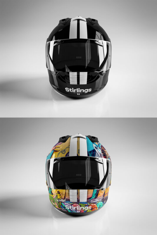
Bright Bold Best
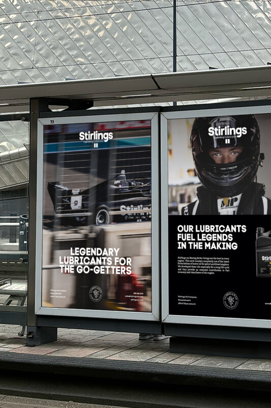
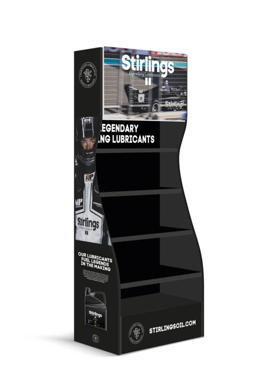
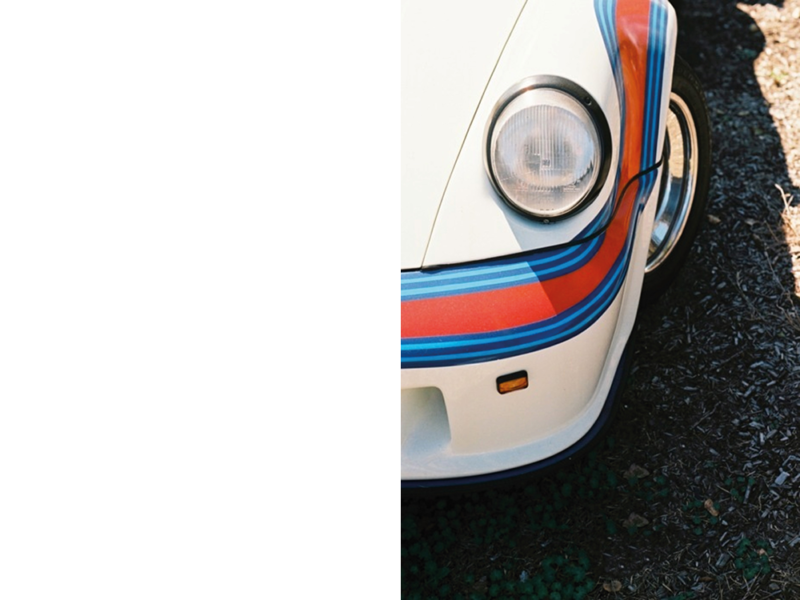
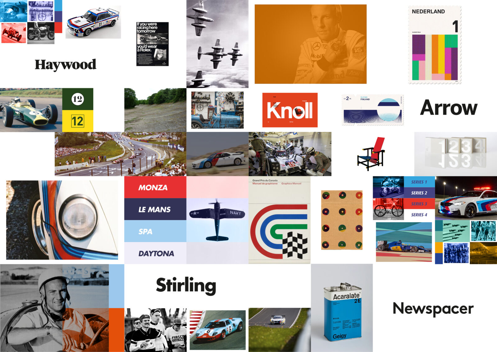
Coming into an industry known for its clichés and the roar of engines and excited spectators, we wanted to take Stirlings out of the noise and break stereotypes by eliminating all unimportant stuff and simplify the way it looks, talks and builds the business.
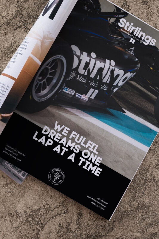
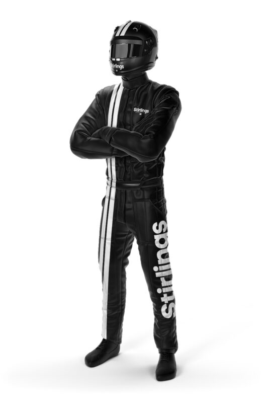
Youth has the Truth
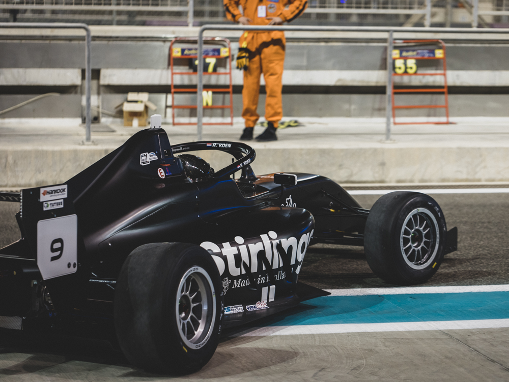
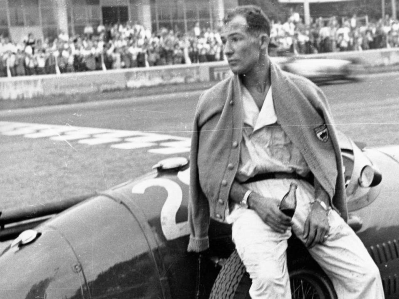
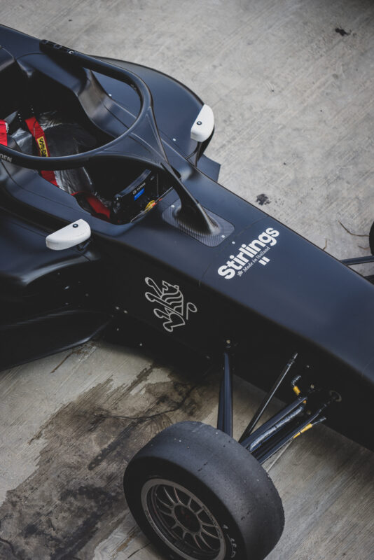
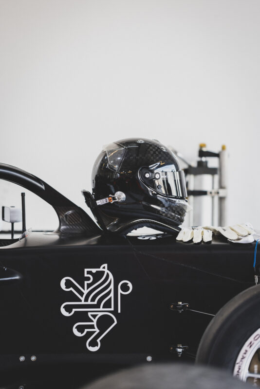
We knighted the company with its iconic name, a nod to Stirling Moss and shaped a mission that helps young racers chase their ambitions at 200 mph and simultaneously build on the success of the oil company. In a bold move to take the world by storm with a devil-may-care spirit, the Stirlings Racing Team was born. By focusing on the heydays of racing, we were able to create a completely different universe and associated lifestyle for a competitive brand competing with the big boys.
)
)
)
)
)
)
)
)
)
)