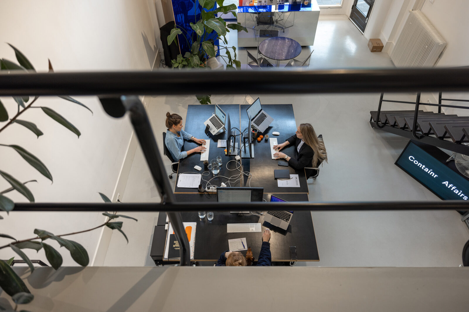
Our assignment was to enhance the existing organizational framework of Schaften Leasing, a subsidiary of Schaften Group, while strategically positioning it for optimal competitiveness. The goal was to establish a contemporary brand within the context of Schaften Group, a prominent leader in the Dutch market.
Focus on brand, sector and product
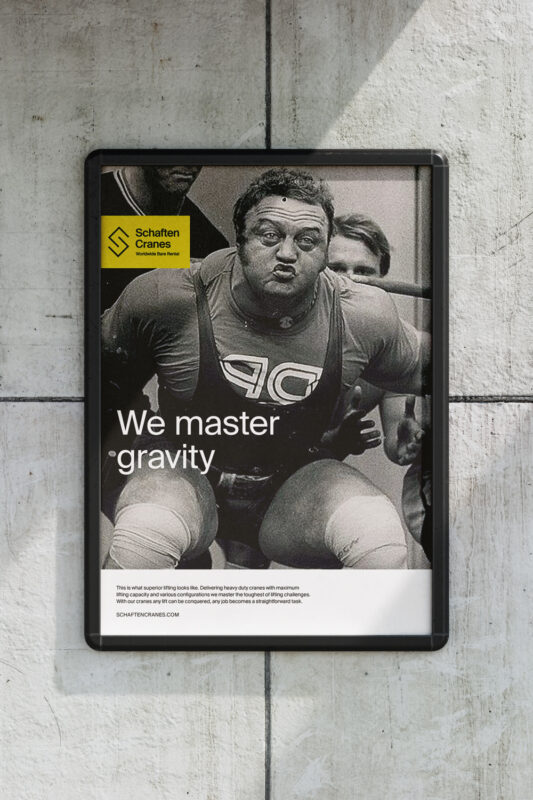
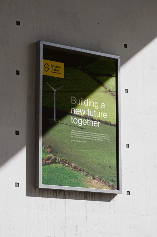
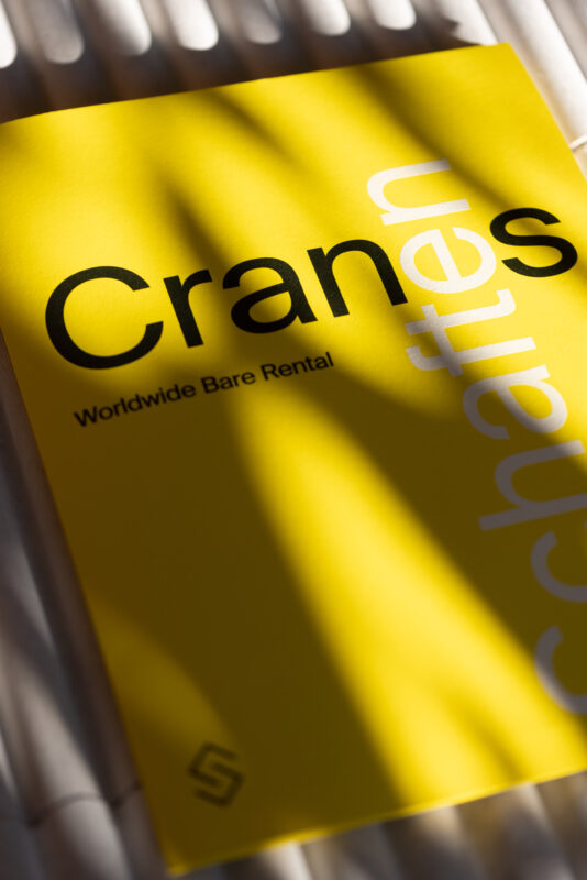
The crane industry is characterized by its traditional nature. Flicking through an industry publication, one would observe that 99 percent of crane rental ads typically showcase the entire product. We set out to do it differently. We’ve defined three types of communication points that need to be addressed: brand, sector and product. The choice of use depends on what Schaften Cranes wants to accomplish: stand out in the crowd or resonate with a familiar audience.
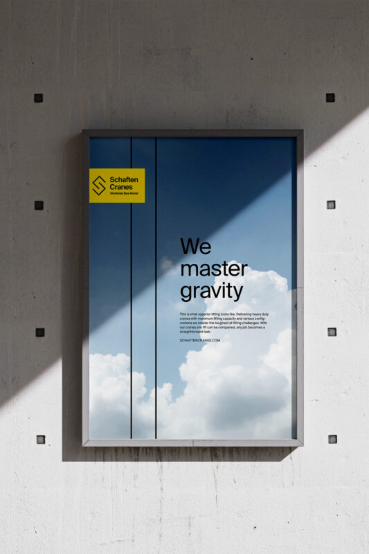
Mastering gravity
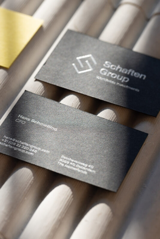
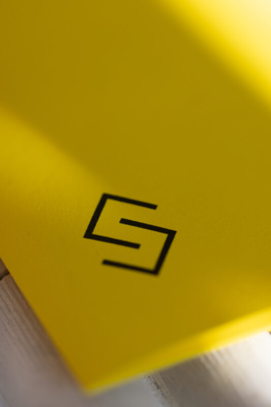
As a subsidiary brand of the Schaften Group, we changed the Schaften Leasing name in a subtle but important way. The name had to unmistakably tell what the company does. Therefore it was dubbed ‘Schaften Cranes’. Design wise, the new identity radiates that hands-on service approach with clean, recognizable shapes and colors fitting for a modern and trustworthy business. The logo features the letter ‘S’ as a crane hook designed with sleek lines that can be used stand alone, as a strong marker. The company name is written in a Swiss font that is both neutral and strong. It complements the edgy, sharp crane hook.
Clear positioning, clear communication, clear distinction
The ‘We master gravity’ promise expressed by a series of metaphors without actually showing the entire crane, is unique in the market. The new logo and company name give it an established look making it stand out from the competition and a powerful brand within the Schaften Group. The website is the culmination of all these things bringing significant growth in engagement and visibility worldwide.


)
)
)
)
)
)
)
)
)
)
)
