Leertouwer Schilders is a painting company, a family-owned business that goes back four generations. It all started in 1897 with maintenance work on monumental buildings. This specialist work earned them the reputation of expert painters. Its team of painters rely highly on a great deal of responsibility, dedication and the ability to pass on their artistry to the next generation.
Preach what you practise
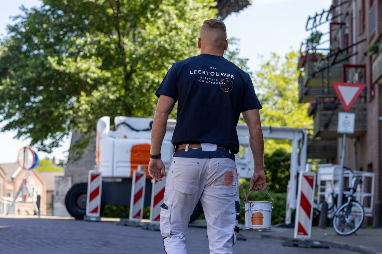
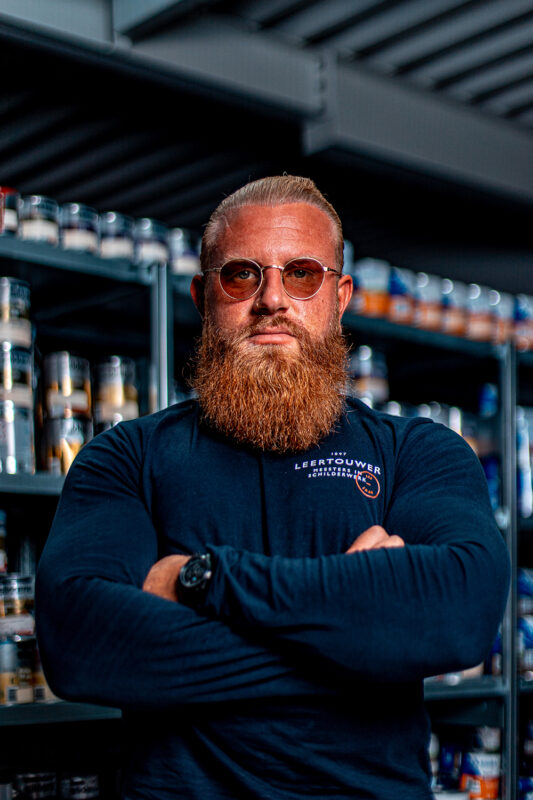
Labour becomes more and more expensive, skilled workers are hard to come by and a veil of distrust hangs over the construction industry. For Leertouwer —a family business— it’s a necessity to rise above it and preach what they’ve practised for generations: being master painters. The strength lies in its workers. It’s a business of highly skilled craftsmen loyal to the company that value quality and have compassion for the process and all the stakeholders involved.
Modern craftsmanship
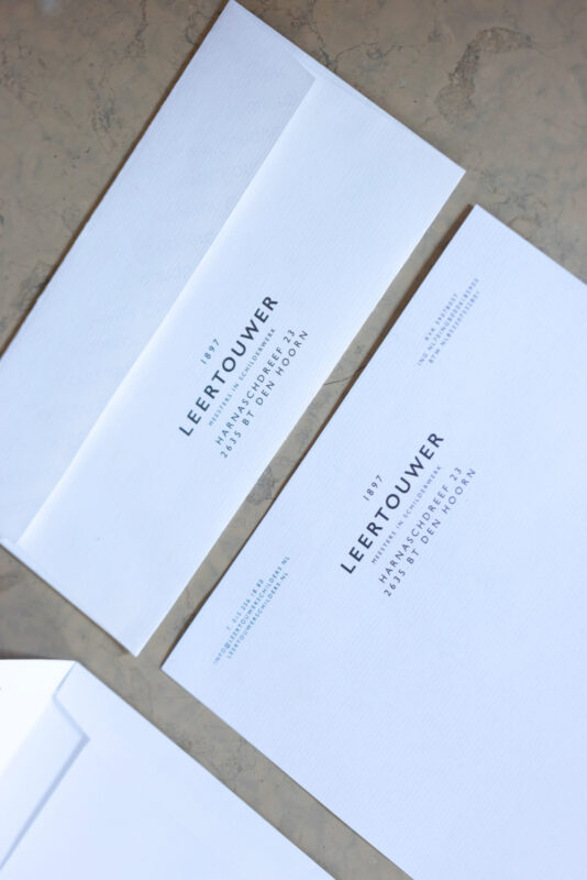
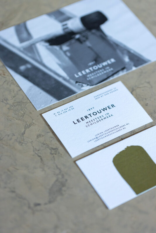
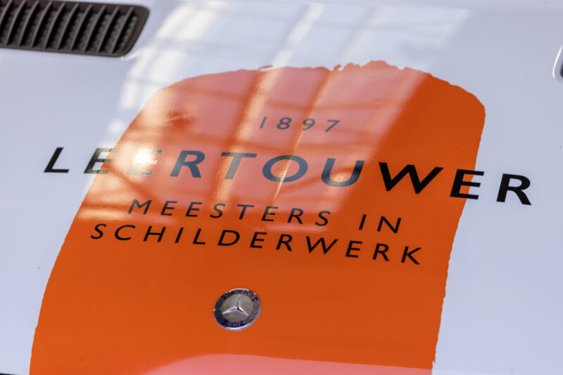
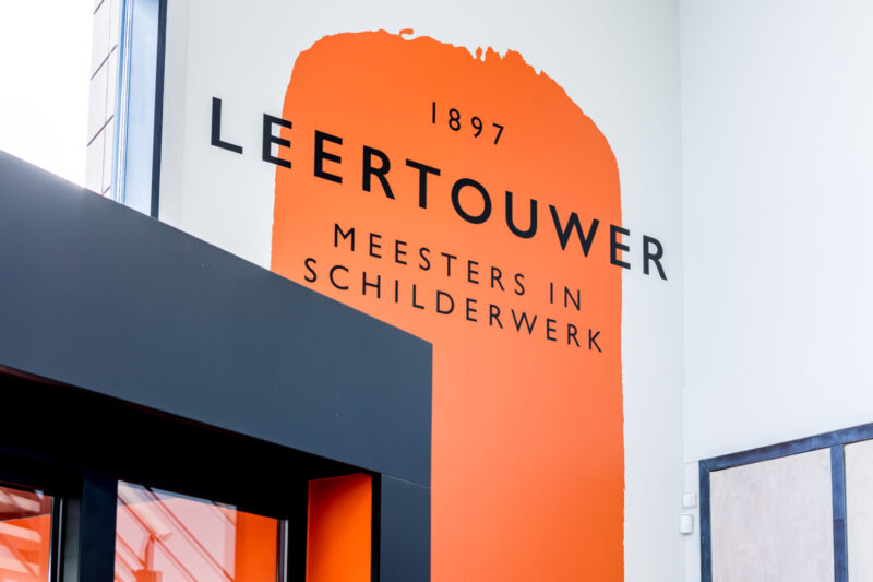
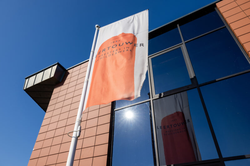
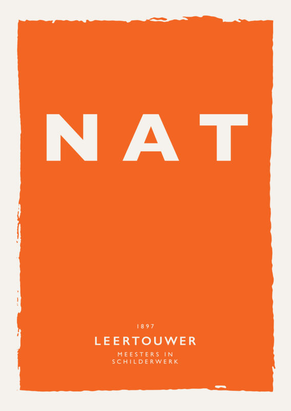
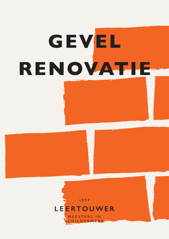
The message of craftsmanship is shown in different layers. The logo has a modern vintage look with the wide spaced all caps lettering its multiple layers of information above and below ‘Leertouwer’. An orange paint stroke is also a branding element emphasising craftsmanship. The stationary design is a blueprint for all items. The vintage inspired layout complements the logo seamlessly. Especially in the letterhead. All important information —like contact and bank account— is neatly centred around the logo in two lists with an equal number of lines. This ensures a layout fitting a company of craftsmen.
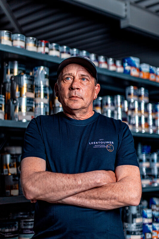
Sociability is key
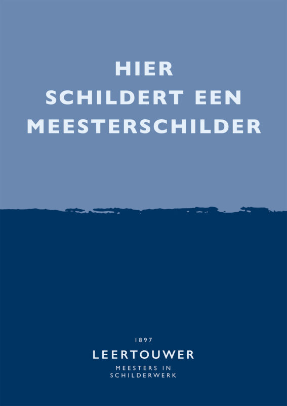
While the logo and workers radiate craftsmanship, expertise, style and dedication, the social aspect is just as important. Even simple messages like ‘wet paint’ are carefully designed to fit the brand’s identity. It shows the ownership Leertouwer likes to take in their work and the clarity they want to send out towards stakeholders involved.
An authority on painting
Leertouwer Schilders’ move towards clients like healthcare institutions, educational institutions, owners’ associations and housing corporations has been a successful one for a more consistent stream of work. The positioning of master painters has had an impact on new business and recruitment. Leertouwer has become a reassuring choice to new clients and although good painters are scarce, workers prefer Leertouwer above other companies.
)
)
)
)


)
)