With a turnover of 391 million Euros in 2020, Janssen de Jong Group is a Dutch top 10 player in the construction branch. The Group has more than 35 autonomous subsidiaries in her portfolio with unique qualities and impressive track records. From innovative Urban Mining companies that harvest and recycle materials for circular construction to companies that restore iconic monuments like Rijksmuseum Amsterdam and Paleis ‘t Loo.
Holistic approach
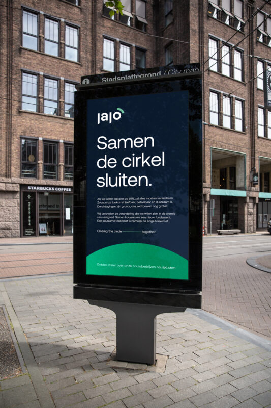
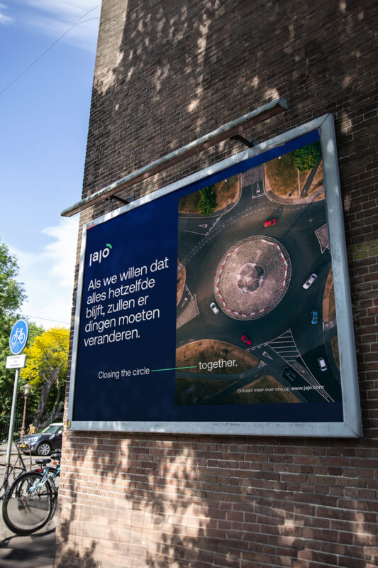
Janssen de Jong Group wanted to move away from their quite comfortable positioning as partner in the real estate cycle to establish itself in the top of Holland’s most sustainable construction companies. A bold purpose that needed extensive restructuring and repositioning. That’s where we came in. Research taught us the Group needed to continue in her decentralised operations, which defined the House of Brands structure and a carefully created branding policy. We have recalibrated their fundamentals, allowing them to excel in circular construction and prioritise human capital with environmental impact. Opening a new platform for dialogue and communication. One that moves away from the typical realm of construction’s visual language towards a more holistic approach that offers the space to give substance to the new tagline ‘Closing the circle, together’.
Rebrands are catalysts for change
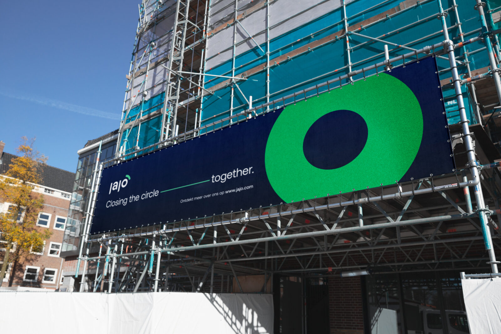
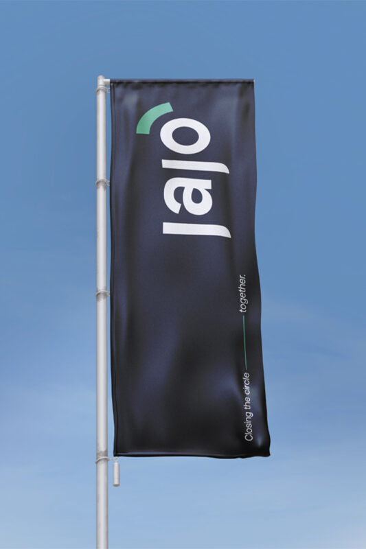
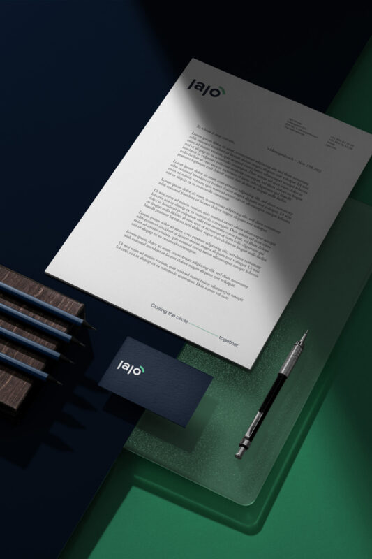
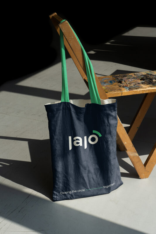
We shaped a new brand architecture that focuses on the Group’s circular activity: From Developing, to Building, to Maintaining, to Renovating to Harvesting. The renewed ambition became a reactor to reshape the brand identity, look & feel and tone of voice. In the JAJO wordmark the tagline ‘closing the circle, together’ is embedded in the letter ‘O’ and the bright green ring segment —nicknamed the eyebrow— represents the group’s business units. The sun embedded in the identity embodies a new dawn and the circle emphasises the sustainable mission. In the tagline connected the words ‘circle’ and ‘together with a long dash, making it a coherent layout.
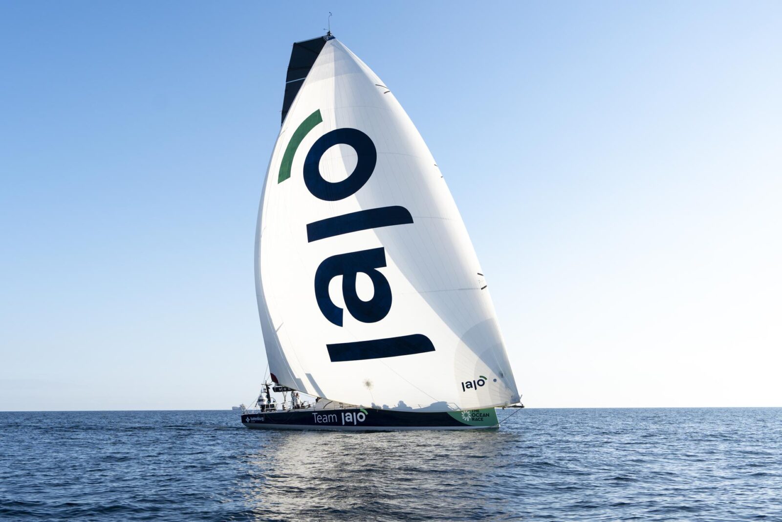
Big rebranding, big reveal
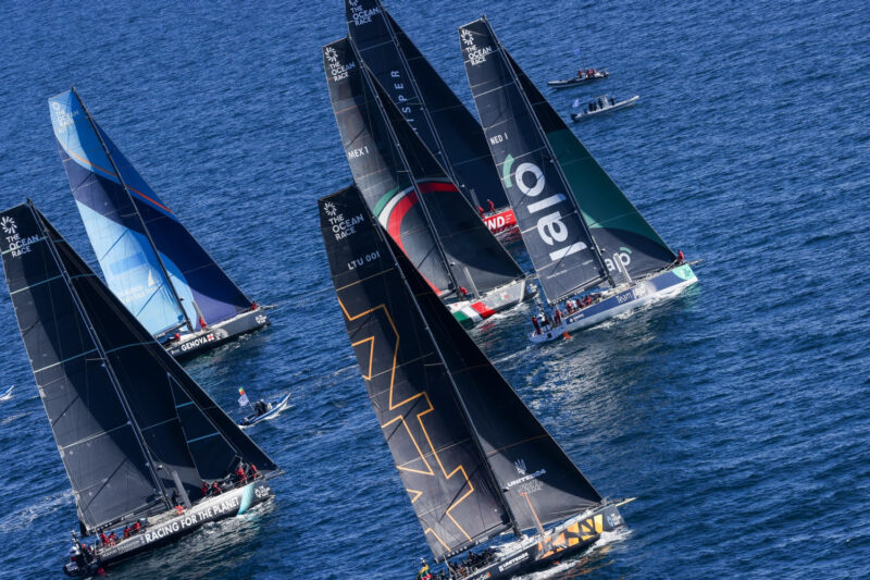
JAJO is announced to the world on the biggest stage imaginable. At The Ocean Race. Depicted with a huge logo on the sails, the Dutch boat and Team JAJO is sailing around the world. The team with seasoned sailors and talented youngsters is predicted to be one of the main contenders in the race. The Ocean Race with its sustainable mission and 6 month duration is the ideal event to do a big reveal. We wish the sailors the best in this clash of the titans. Internally, the new brand needed to be introduced to its 1200+ employees across the globe. We came up with a series of 5 straightforward and fun introduction videos.