Flamingo is a Frutos Tropicales Europe brand, a company that specialises in tropical fruits. Partnering with growers all over the world and at the same time focussing on a small range of fruits, FTE ensures a premium quality product that is both sustainable and a positive driver for local communities and environment.
Credibility is key
To unleash Flamingo’s full brand potential we aimed to make it stand out from its competitors with a strong and credible identity. This involved a small addition to the Flamingo name, a clean and contemporary logo and a sophisticated brand story that balances out the craftiness and the modernness of the brand.
A nod to the vintage
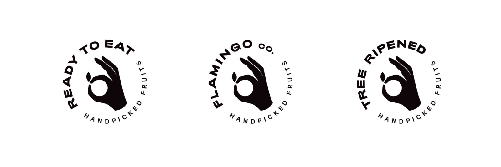
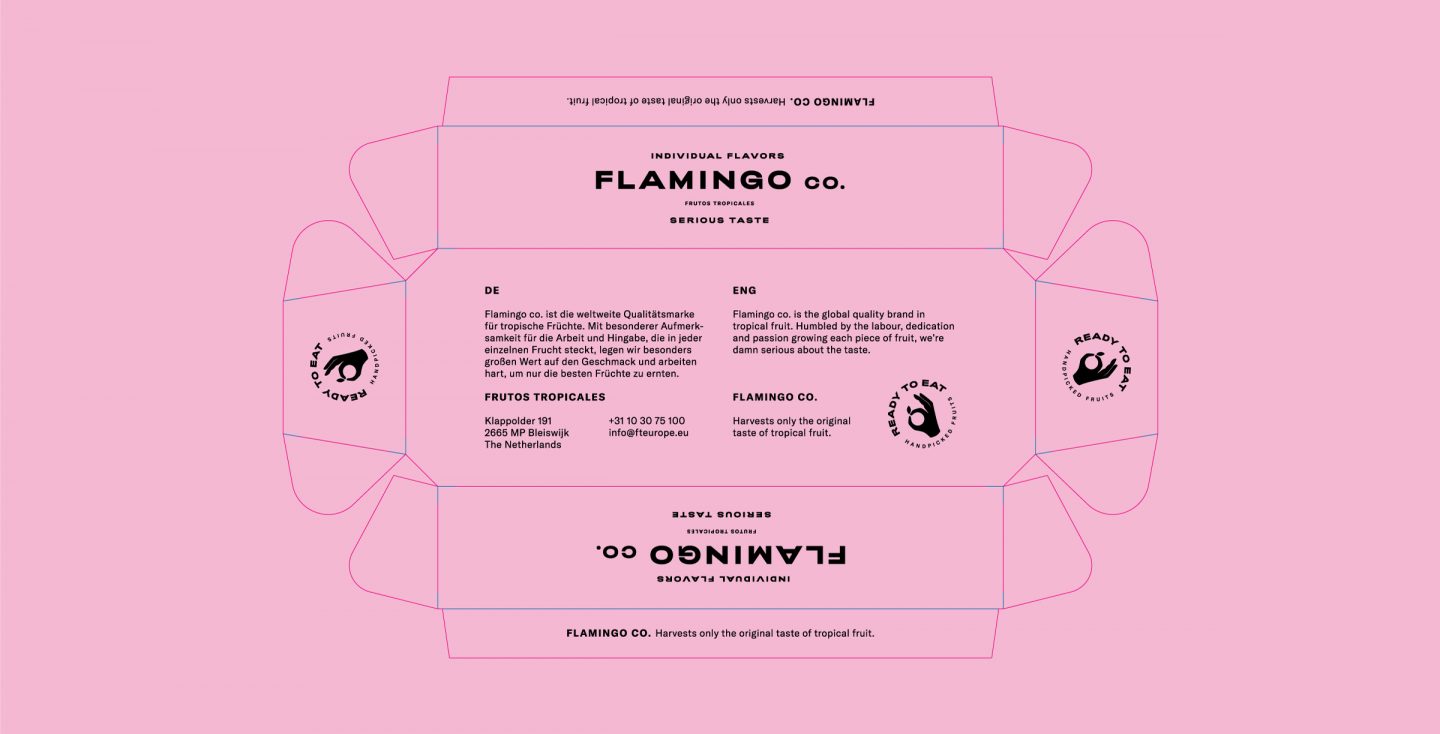
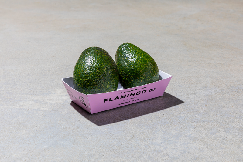
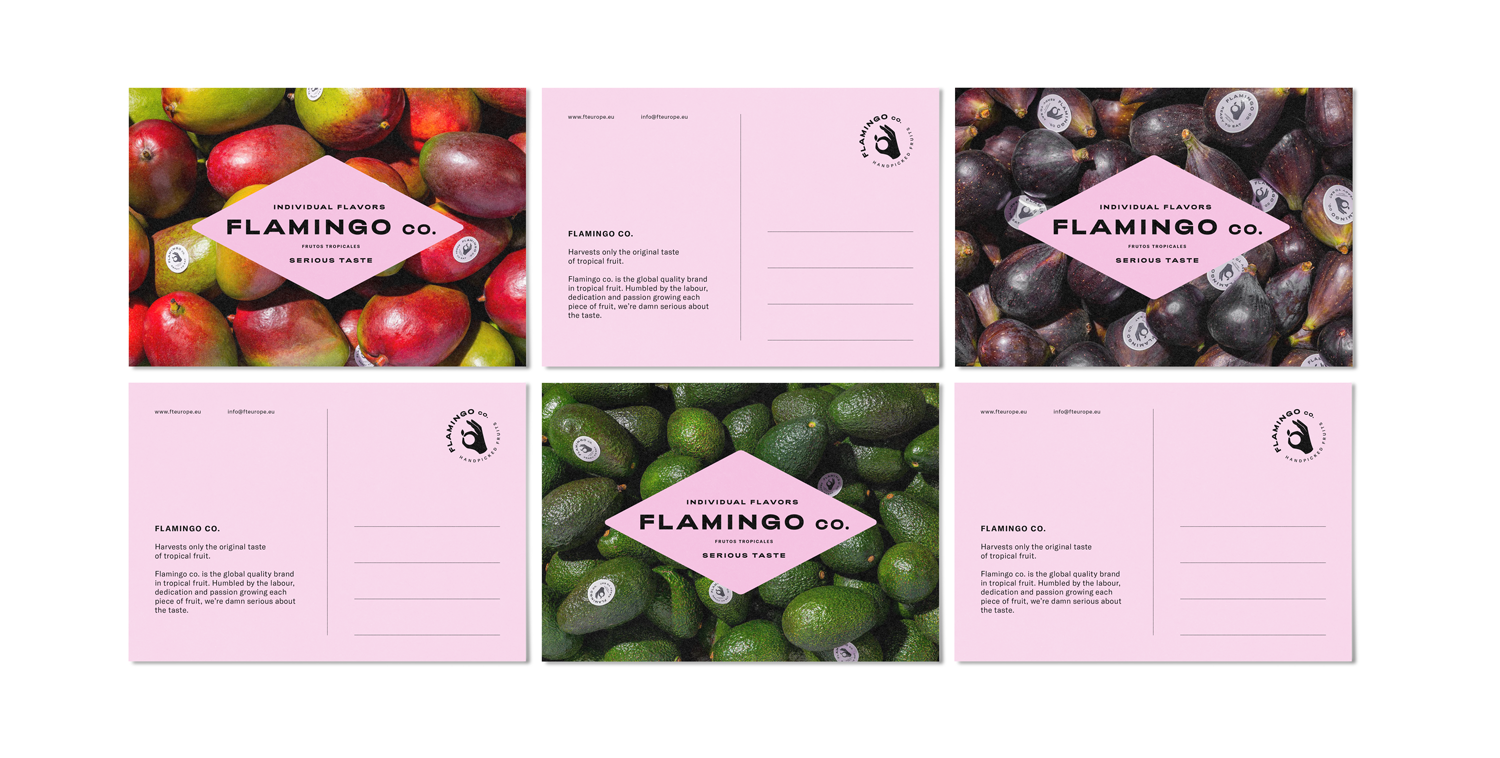
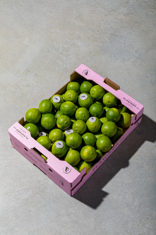
Fruit companies back in the days used wooden crates —burned with their company name and shipping information— to ship their product. We used this as an inspiration to accentuate the authenticity of Flamingo Co. The bold and often wide spaced lettering combined with a diamond shaped seal embrace the vintage. But dialled down to its most basic forms it is elevated to a contemporary iconic logo. The sparse use of colour —humble pink, black and white— heroes the photography and the fruit in the cardboard boxes. Finally, we’ve created stickers that depict qualities of the product like ‘sun ripened’ and ‘handpicked’ adding valuable context to a story driven identity.
The Story
Flamingo Co. is all about humility, colour and light-heartedness. The labour and dedication that goes into a single piece of fruit, the spirit of latin cultures, the unique character of every single farm and family. It all adds onto the Flamingo DNA. Though the logo is clean and contemporary, the story is driven by bright and colourful images of farmers in their sunny desaturated landscapes and the ripeness and juiciness of every single piece of fruit hand picked straight from the fields.
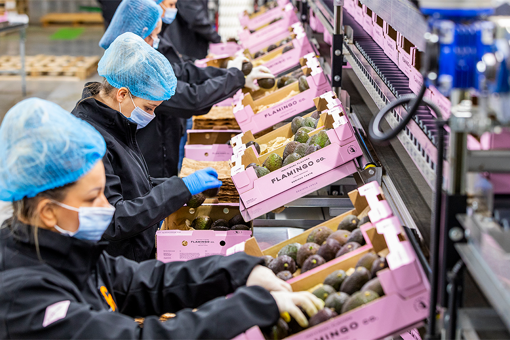
Product and box
As the boxes are stacked up high on a pallet hiding the product from first glance, in many cases the cardboard box is our customer’s first encounter with the product. That makes packaging, especially the boxes, Flamingo’s most important vehicle to establish the brand beyond showcasing the product. Therefore every box no matter size or form has more or less the same layout with the same elements. This ensures the same unboxing experience every new encounter with the product.
The pink fruit boxes stand out, even in all the hustle and bustle of food markets. Amongst the yelling merchants and people moving from one stall to another you’ll always catch a whiff of pink.

)
)
)
)

)
)
)
)
)