ASTO is a beautiful family kitchen store based in the Netherlands. ASTO, founded in 1973, is active in the middle and higher segments and offers high-quality kitchens and appliances to consumers, architects and real estate developers. It has grown exponentially in recent years and needed help with a strategic repositioning and rebranding.
Heart of the home
As we took an in depth look at the hierarchy of the total brand landscape, we’ve created a brand strategy centred around kitchen lifestyle. As the kitchen evolved from a functional space into a proper living area, it has become a connector between other living spaces and the epicentre of the house. The place where you spend time with family and friends.
The affordable luxury brand
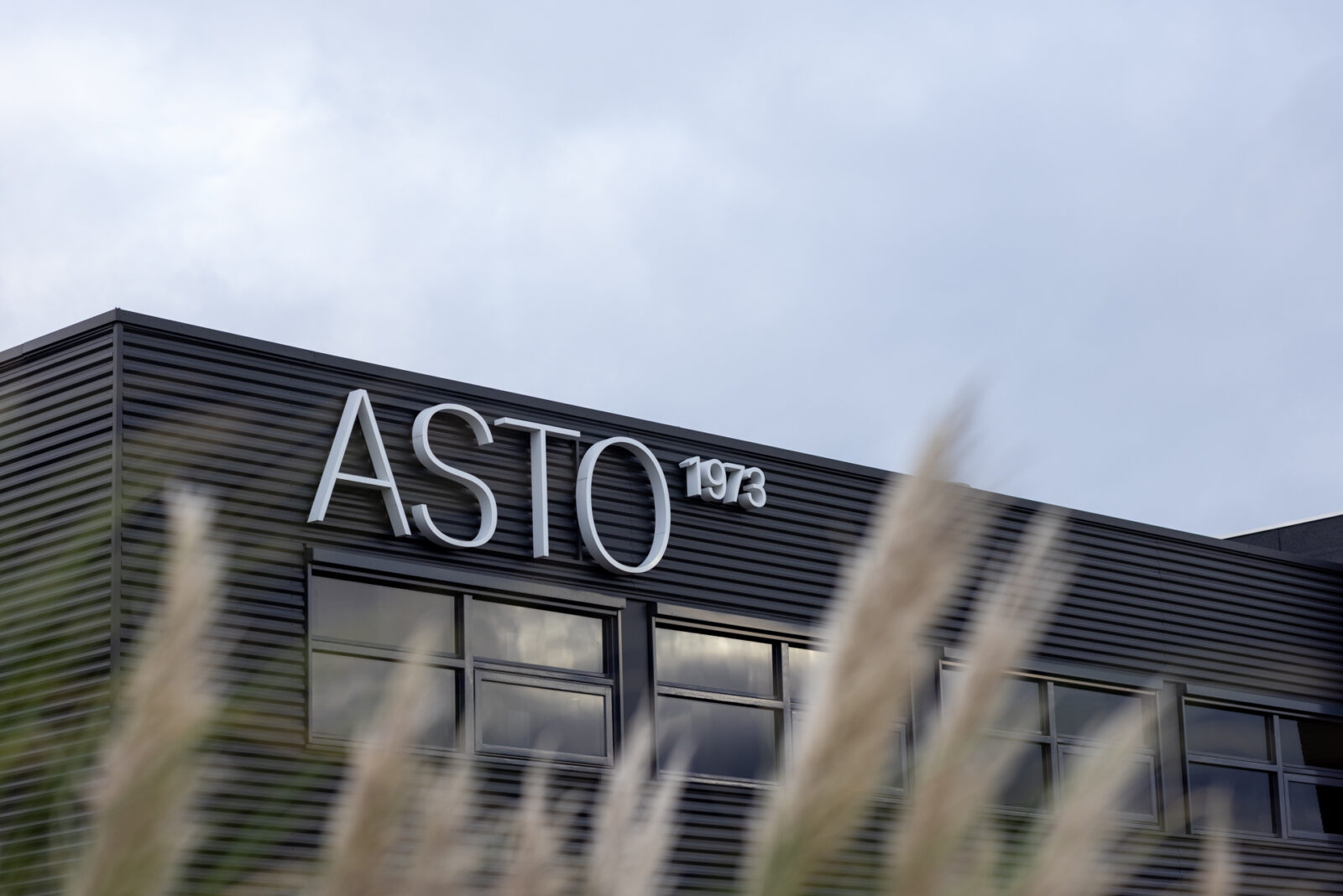
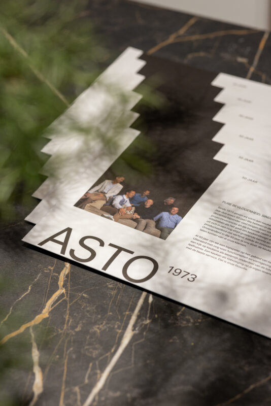
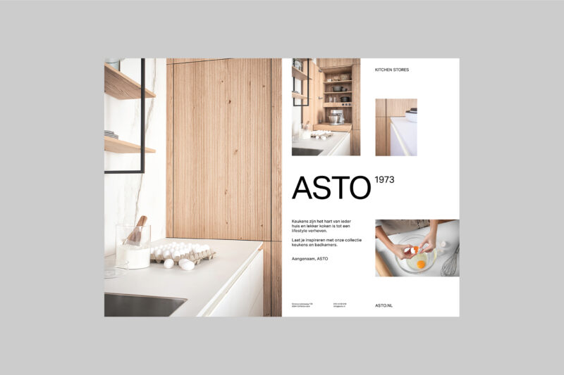
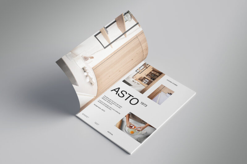
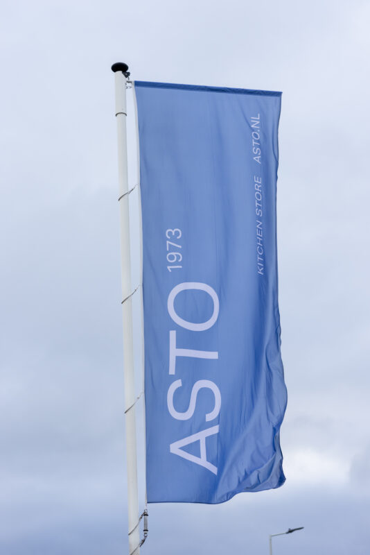
We pivoted ASTO from a project-based kitchen company to an affordable luxury kitchen brand, with three values that mark the renewed Asto brand. Solid for the heritage, knowledge and the drive to stay on top. Warm for the homely vibe and service it provides and Tasteful for the remarkable and tailored approach. The logo is based on a firm font depicting the founding year as a trademark in superscript and behaves as the centerpiece of the design grid. This solidness is warmed up with tactile textures, a homely color scheme and humanistic photography.
A valued member in a family of businesses
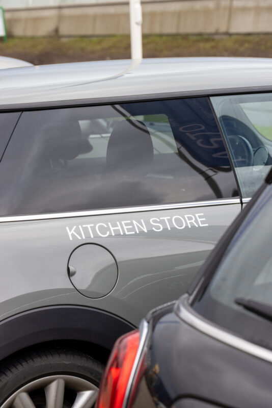
ASTO has worked really hard to change the fabric of its company to fit the new strategy. The identity has been put on display throughout the company, from stationary items to the workers’ clothing. In 2023 the new showroom was opened with new kitchens and appliances and a unique room dedicated to swatches. These major changes that ASTO has made, caught the eye of Dhomus group, who took a share in the company.



)
)
)
)
)
)
)
)
)
)
)
)
)
)
)
)
